Experimental Portrait Book Cover
What are you looking at?
Great question! This is an experimental portrait that was later turned into a book jacket. I was tasked with creating a non-edited portrait that was captivating to an audience. At the conclusion of this project, I was instructed to turn my portrait into a book jacket but not just one book jacket.... two. The second needed to be a typographic solution that correlated with the original.


Process
Portrait
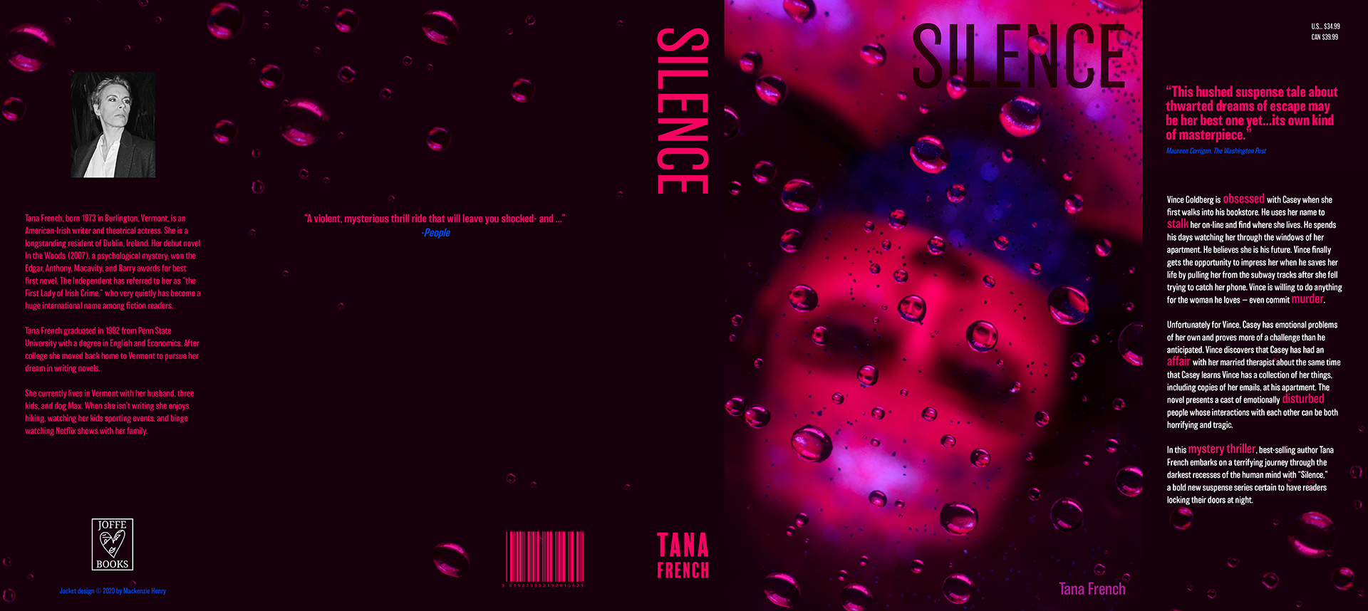
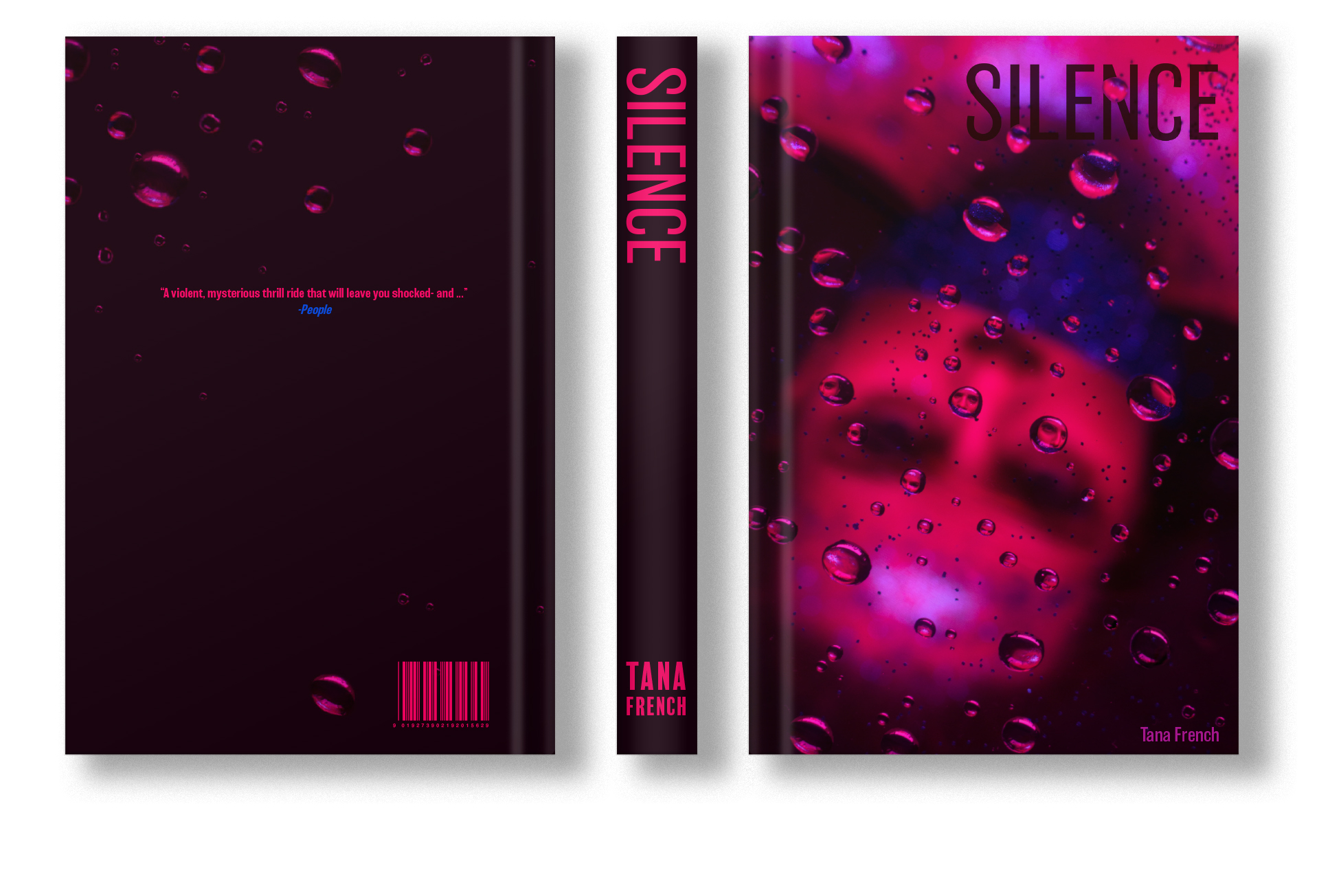
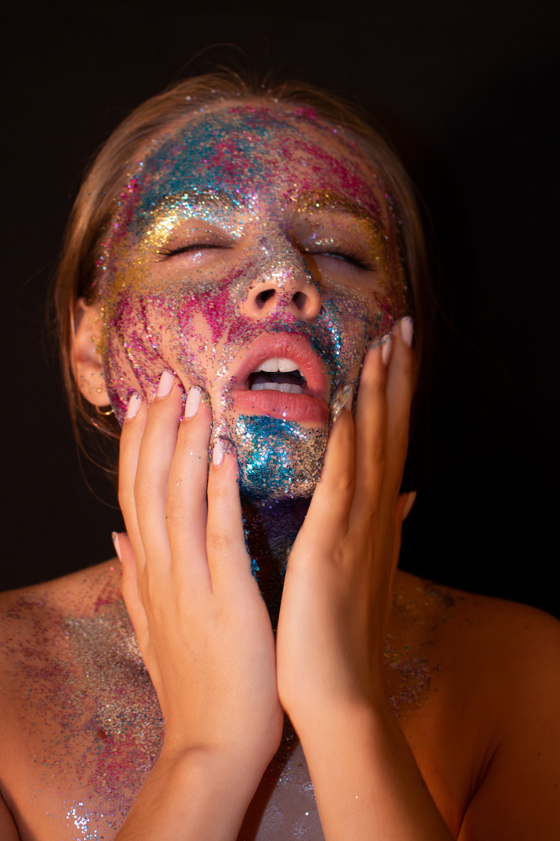
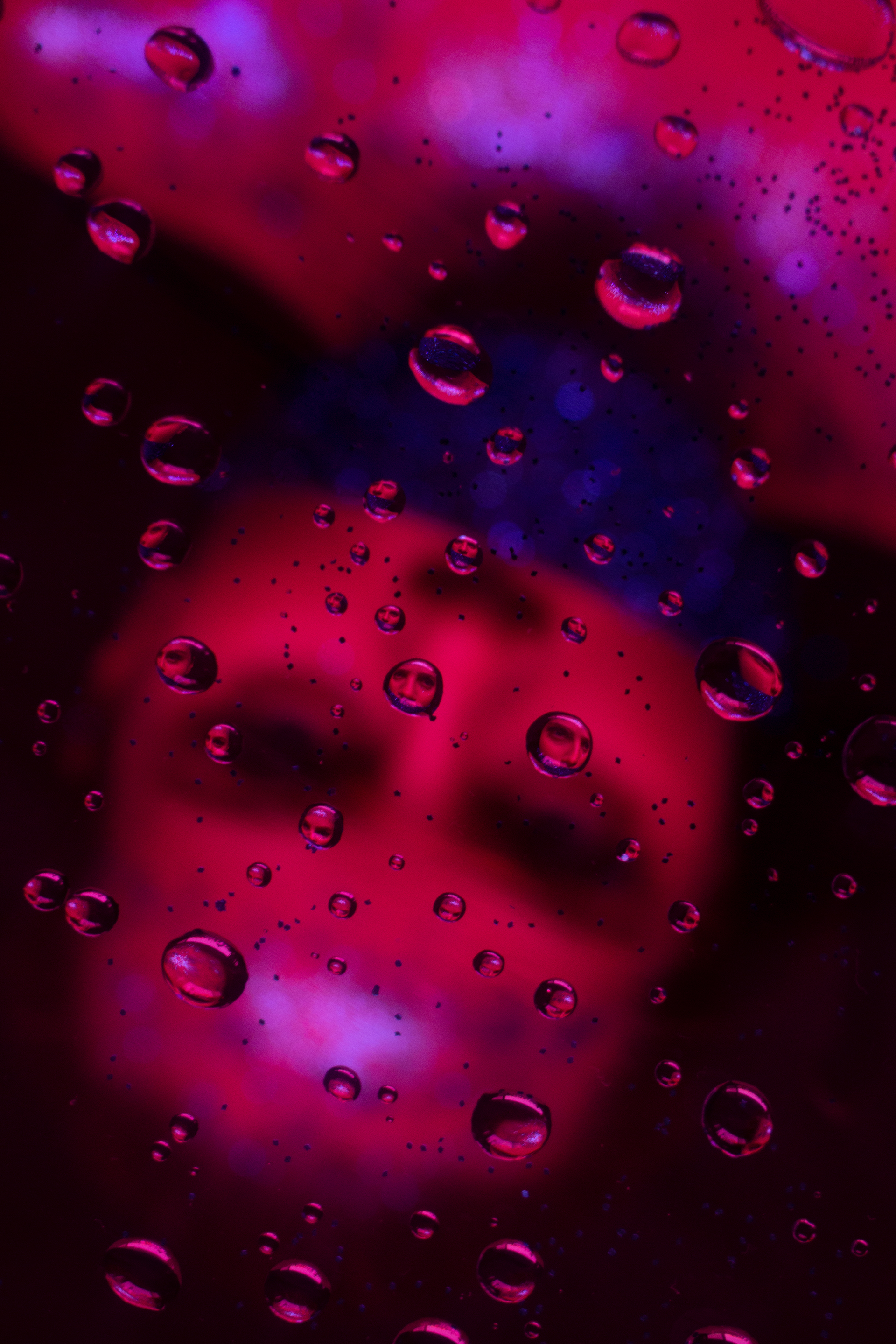
The experimental portrait was a three-week project that focused on experimenting with lighting, compositions, and angles. I started this project by researching unique lighting, concepts, stylization, and famous portrait photographers. This project required no concept however, I wanted to portray the feeling of no escape from yourself or how people perceive you. Though most of my initial photoshoots resulted in subpar images it allowed me to visualize how to portray a message through an image.
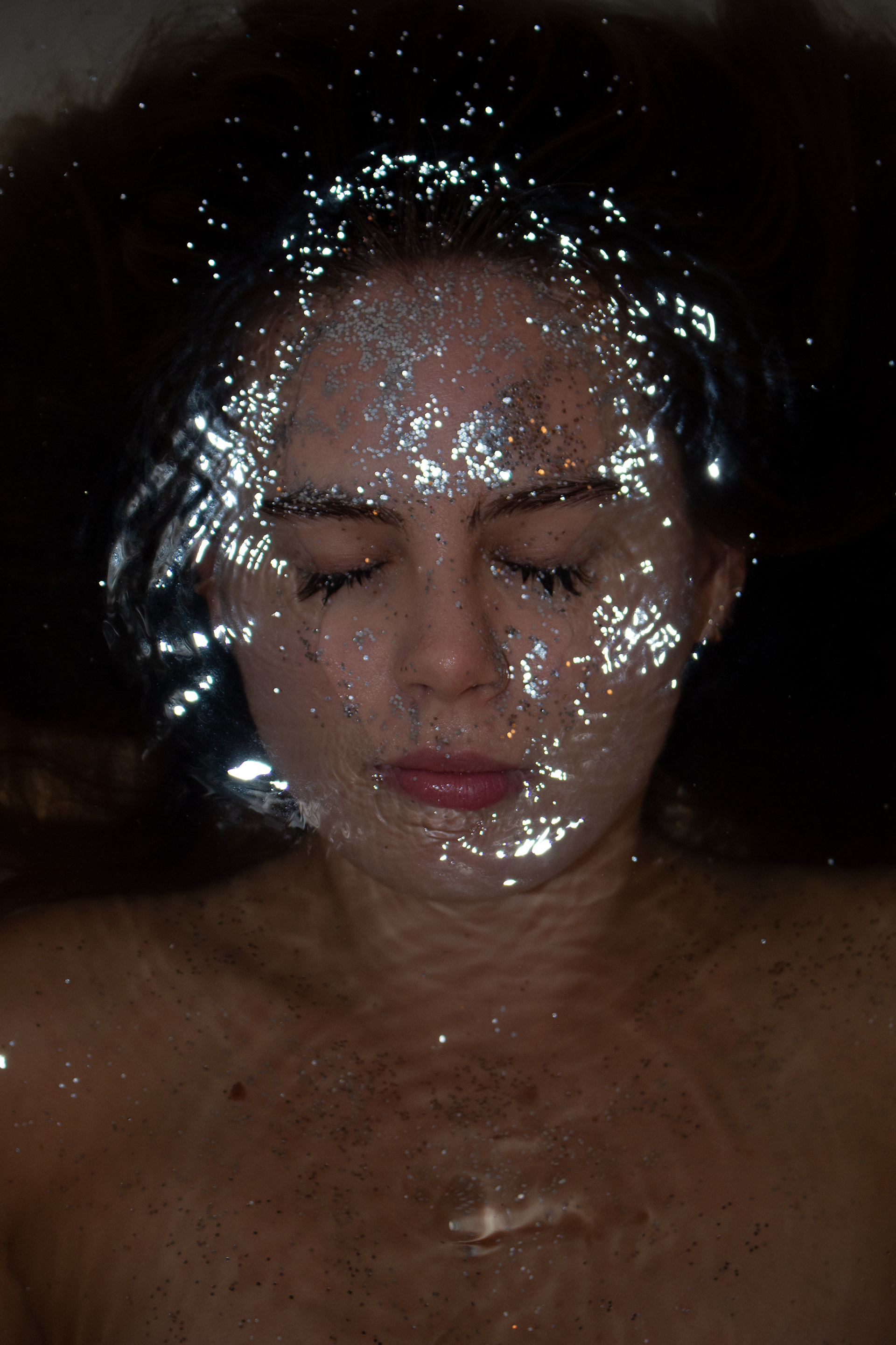
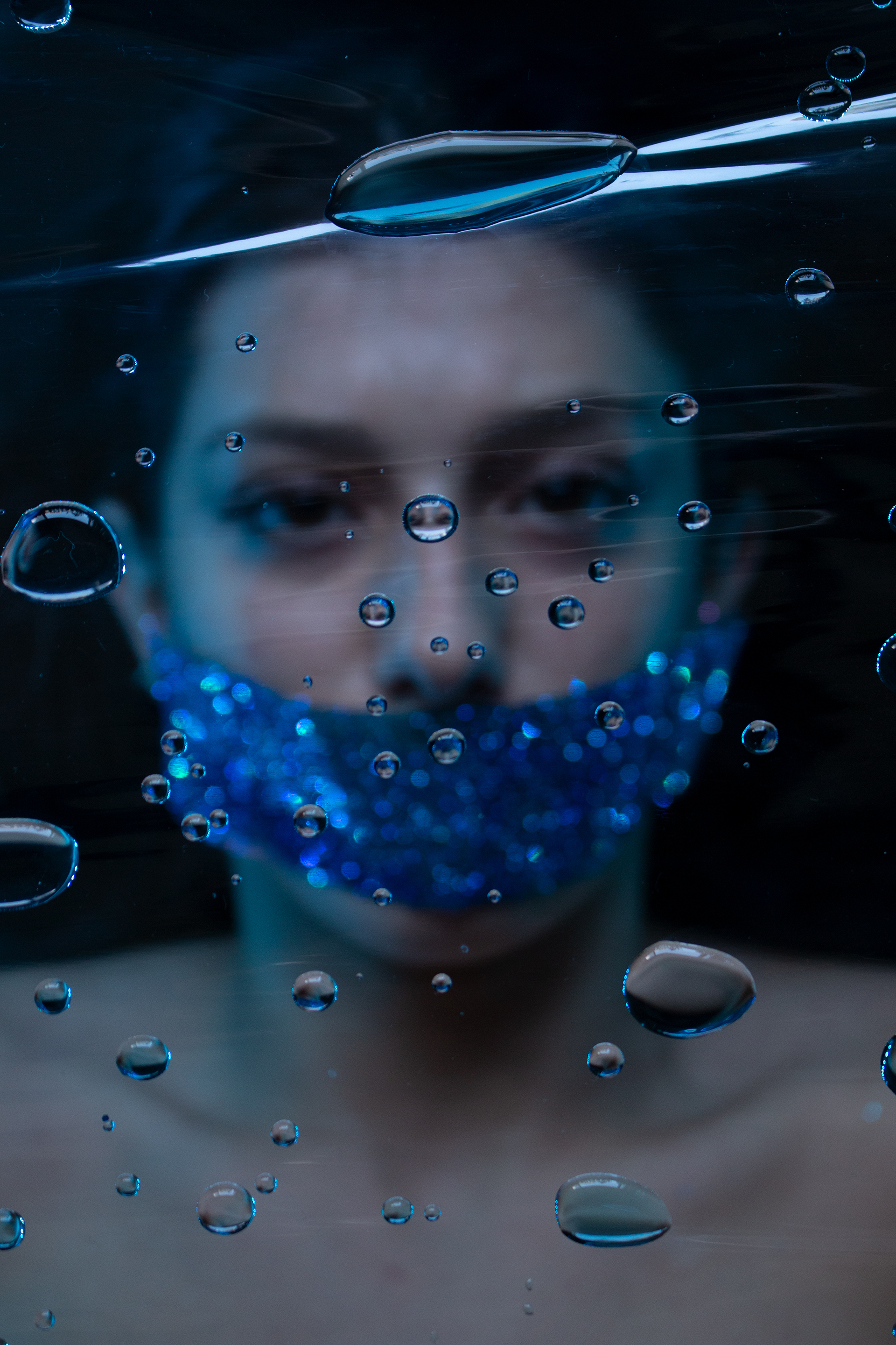
After my first photoshoot I knew I needed another element to make this piece more engaging. I experimented with water and loved how the droplets interacted with the sparkles. However, capturing my model not flinching while I threw water at her face became an issue. So, I came up with the solution to have my model lay under plastic wrap covered in water droplets. This allowed my model to control her facial expressions while the water reflected her face in distorted ways. Flipping the portrait upside down was done so the water droplets were more prevalent.
Credits
These photoshoots were extremely messy, and I suggest never using glitter for anything. Four months later and I still find glitter in my carpet and belongings. A huge thank you to my models Juliet Dicarlo and Hannah Leight for putting up with glitter in places it should never be and being so incredible.
Process
Book Jackets
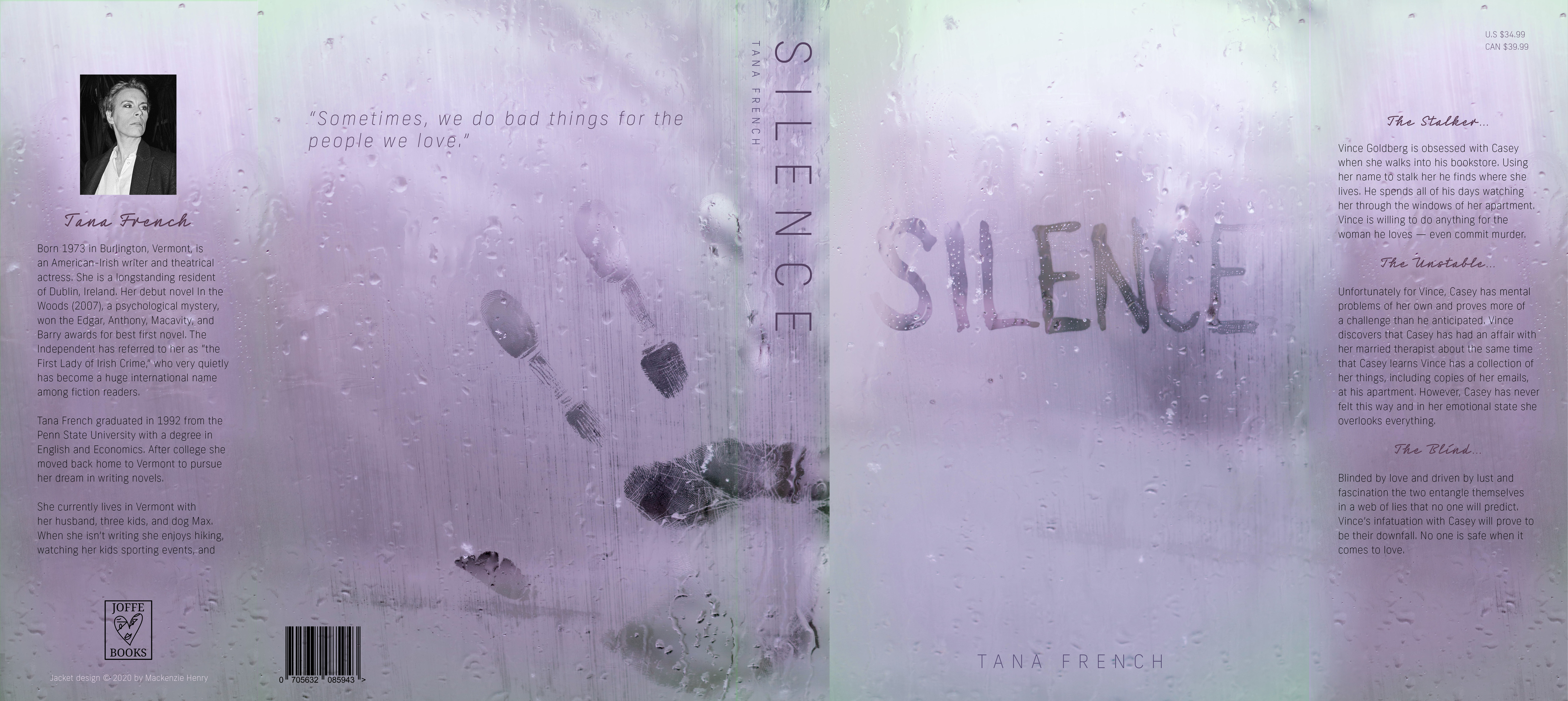
The book jackets were a three-week project that focused on turning a stand-alone portrait into a functional book cover. I started my process by looking at thriller and mystery novels. Stephen King and Tana French covers were my main inspiration for this project. I wanted my book to be based on a crazy love story that turns into a woman’s worst nightmare with stalking, kidnapping, and murder.
Since my portrait was a busy image I struggled with adding text in an intentional way. I wanted a typeface that was simple so the main focus was on the image. I decided on a simple san serif, Balboa, to allow the cover image to be the main focus. Instead of having a secondary typeface I used color, size, and italics to add variety and texture.
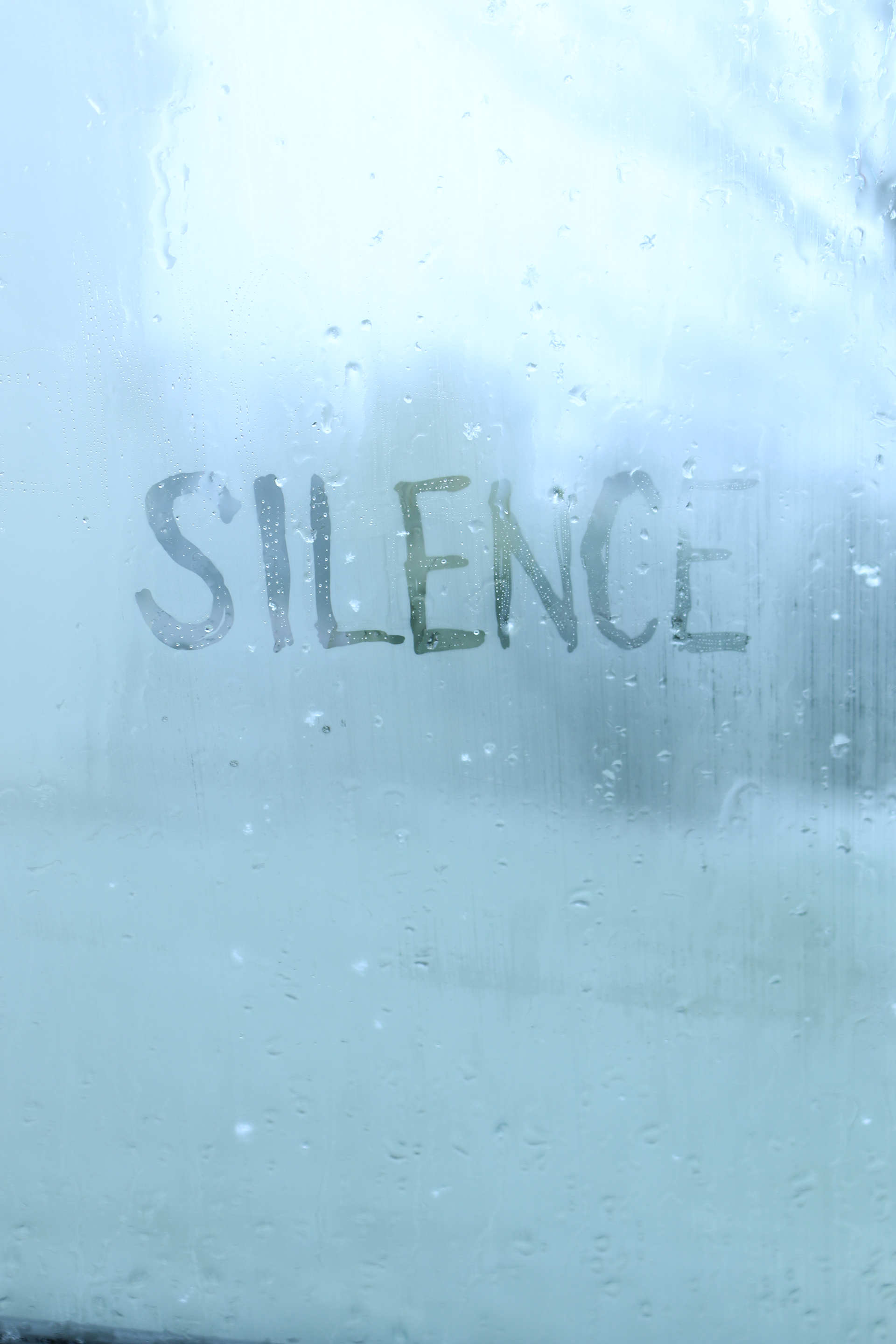
For the typographic book jacket I made ink handprints and painted silence in ink. I also photographed ink and water droplets to possibly incorporate. These were interesting images, but they were not what I had in mind for my final. I wanted my cover to display more of a crazy stalker feel. My solution was sitting in a freezing car while it snowed. I used the fogged-up windows to write “Silence” and create handprints against the glass. This technique created the creepy, mysterious cover that I was aiming for. I used Frank New as the main typeface and Neonoir Bold as the secondary typeface. The secondary script font was used to show the romantic side of the book and break up content.